Form follows function
First understand what a thing is for, then decide how it looks.
Bauhaus
A German design school that existed for just fourteen years. With circle, square, triangle and red, yellow, blue, it taught the world to design for industrial production.
First understand what a thing is for, then decide how it looks.
Artists must know materials and machines; designs must be producible by industry.
Any design can start from circle, square, triangle and the primary colours.
Germany after the First World War had to be rebuilt. Factories could already mass-produce goods, but artists and craftsmen were still working in small workshops, and machine-made objects were either crude or imitated expensive handmade ornament. There was a gap between art and industry.
In 1919 the architect Walter Gropius founded a new school in Weimar to reconnect art, craft and technology. Students first took a foundation course in form, colour and material, then moved into workshops for metal, wood, textiles and printing. The goal was good objects that factories could mass-produce and ordinary people could afford.
To find a universal language suited to machines, the Bauhaus teachers reduced everything to basic elements: circle, square, triangle; red, yellow, blue. In graphic design they used sans-serif type, asymmetric layouts and photography. Herbert Bayer even proposed using only lowercase letters, because “we don’t speak in capitals”.
In 1933 the school closed under Nazi pressure. Its teachers and students emigrated around the world, and in doing so carried Bauhaus ideas to America and into all of modern design.
Gropius founds the Bauhaus in Weimar and publishes its manifesto.
First major exhibition: “Art and Technology – A New Unity”.
Move to Dessau; Bayer leads the print and advertising workshop and adopts all-lowercase.
Gropius’s Dessau building opens, itself a Bauhaus manifesto.
Ludwig Mies van der Rohe becomes director.
The school closes under Nazi pressure; four years later the New Bauhaus opens in Chicago.
Circle, square and triangle are the start of every composition, often alone, in dialogue.
Red, yellow, blue plus black and white. Kandinsky paired yellow with triangle, red with square, blue with circle.
Geometric sans-serif, often lowercase only, stripping away everything unnecessary.
Heavy black rules divide the page; text can run vertically or rotate, creating clear rhythm.
Moholy-Nagy’s “typophoto” treats photographs and type as equal visual material.
Bauhaus posters used geometry, heavy rules and sans-serif type to turn an exhibition into a design manifesto.
Bayer’s Universal alphabet had only lowercase letters, each built from circles and straight lines: a typeface for the machine age.
In 1923 Kandinsky ran a survey at the Bauhaus: which colour best suits the triangle, the square and the circle? Pick a colour for each shape, then compare with his answer.
Matches with Kandinsky: 0 / 3 His view: the sharp triangle is bright yellow, the steady square is red, the calm circle is blue.
Founder who brought artists into the factory.
Brought photography, type and new technology into graphic design.
Argued for lowercase only; designed Bauhaus print and even banknotes.
His poster of circles, squares and lines became a Bauhaus emblem.
Star of the metal workshop; her designs are still produced.
#D62828#1D4E9E#F2C200#111111#F1EBDDJost / Futura / Bayer Universal (historical)
:root {
  --red: #d62828; --blue: #1d4e9e; --yellow: #f2c200;
  --black: #111; --ecru: #f1ebdd;
}
body { background: var(--ecru); color: var(--black);
  font-family: "Jost", "Futura", sans-serif; text-transform: lowercase; }
.triangle { clip-path: polygon(50% 0, 100% 100%, 0 100%); background: var(--yellow); }
.square   { background: var(--red); }
.circle { border-radius: 50%; background: var(--blue); }Event explained · 01
Gropius founds the Bauhaus in Weimar and publishes its manifesto.
Historical work / document. See the caption for photograph dates and editions.
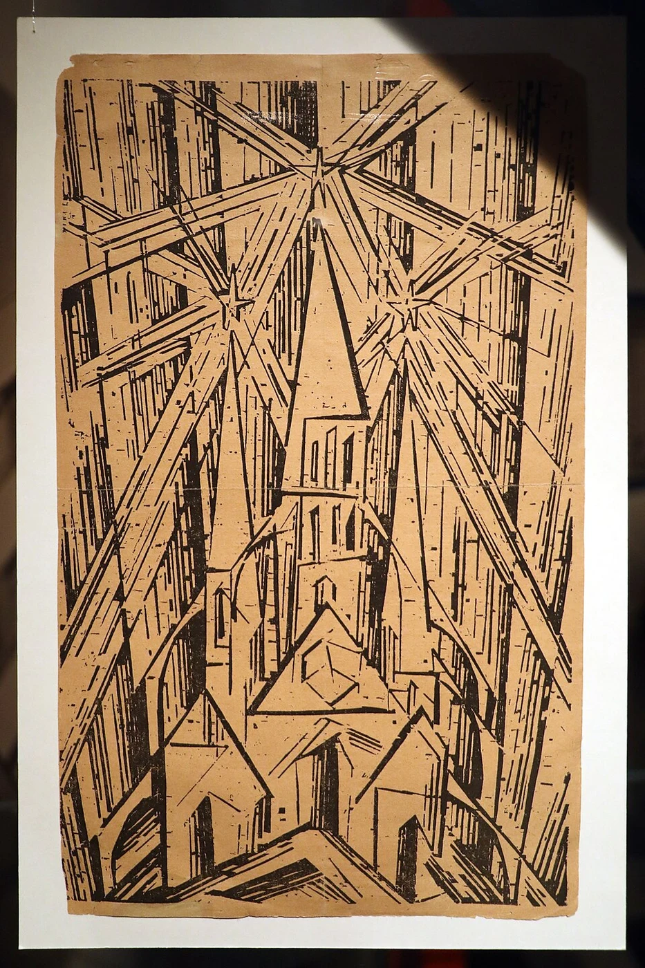
Lyonel Feininger, woodcut cover of the 1919 Bauhaus manifesto; photographed in the Kulturen collection
Lyonel Feininger (work); Francesco Bini (image source) · Image source ↗ · CC BY-SA 4.0Use the caption to identify the actual person or work, then compare it with the creative methods and visual rules described above.
Event explained · 02
First major exhibition: “Art and Technology – A New Unity”.
Historical work / document. See the caption for photograph dates and editions.
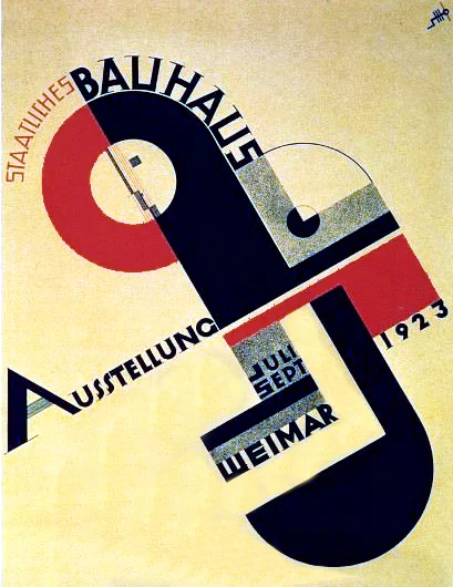
Joost Schmidt, Bauhaus exhibition poster, 1923
Joost Schmidt · Image source ↗ · Public domainUse the caption to identify the actual person or work, then compare it with the creative methods and visual rules described above.
Event explained · 03
Move to Dessau; Bayer leads the print and advertising workshop and adopts all-lowercase.
Context image: related people, works or visual background, not a record of this event. See the caption for dates and editions.
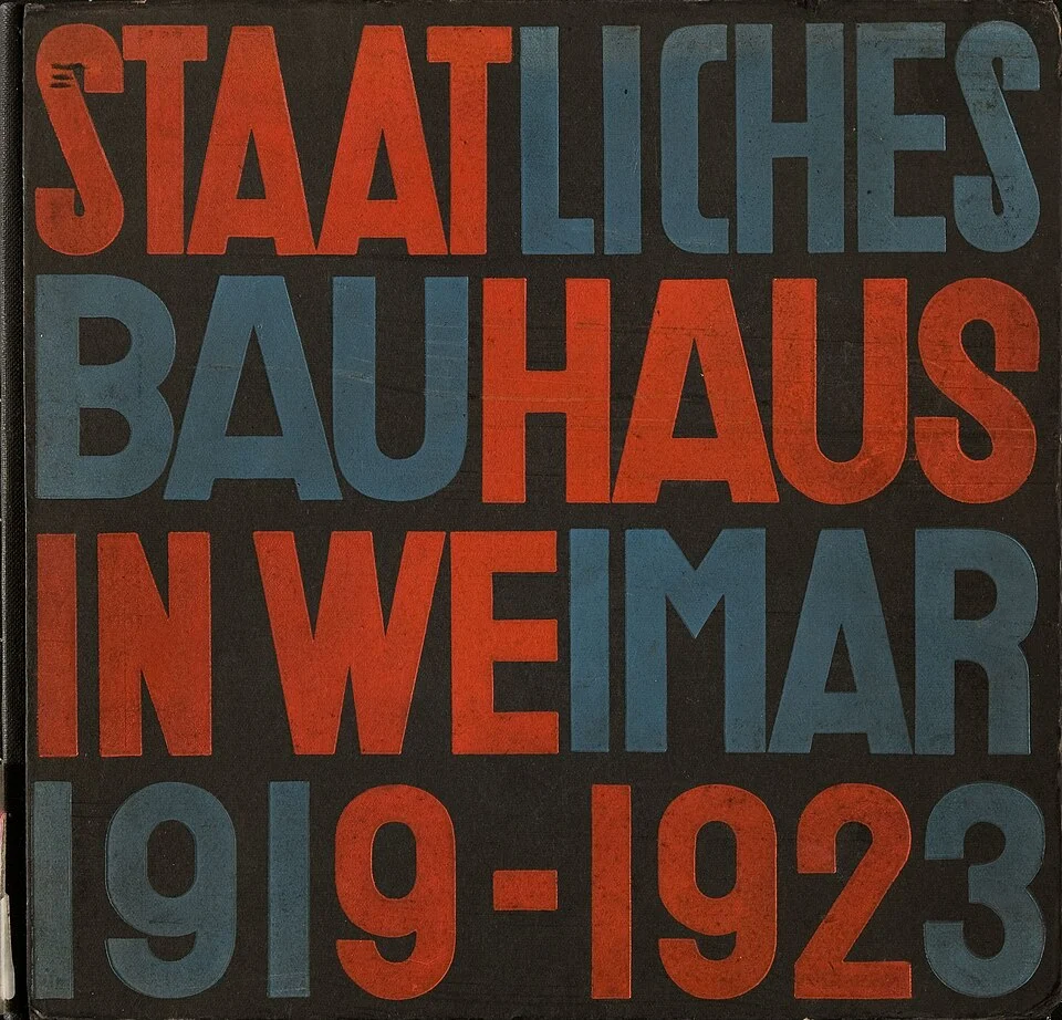
Herbert Bayer, Bauhaus 1919–1923 publication cover, not the Universal alphabet
Herbert Bayer / Unibib Weimar · Image source ↗ · CC BY-SA 4.0Use the caption to identify the actual person or work, then compare it with the creative methods and visual rules described above.
Event explained · 04
Gropius’s Dessau building opens, itself a Bauhaus manifesto.
Historical work / document. See the caption for photograph dates and editions.
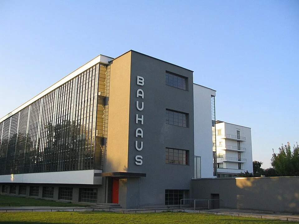
Bauhaus Dessau building designed by Walter Gropius
Walter Gropius (architecture); photographer not identified in source · Image source ↗ · Public domainUse the caption to identify the actual person or work, then compare it with the creative methods and visual rules described above.
Event explained · 05
Ludwig Mies van der Rohe becomes director.
Context image: related people, works or visual background, not a record of this event. See the caption for dates and editions.
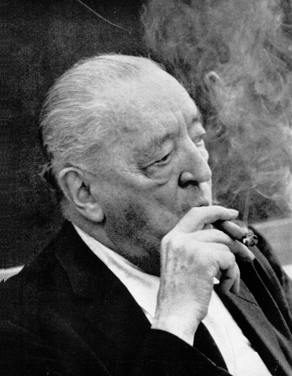
Actual portrait of Ludwig Mies van der Rohe in Arts & Architecture, June 1960; not his appointment in 1930
Unknown author · Image source ↗ · Public domainThe portrait introduces the creator. Their work and visual methods are explained above and in this page’s visual DNA and laboratory.
Event explained · 06
The school closes under Nazi pressure; four years later the New Bauhaus opens in Chicago.
Context image: related people, works or visual background, not a record of this event. See the caption for dates and editions.
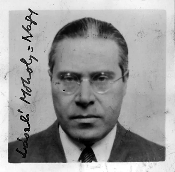
László Moholy-Nagy — reference photograph
Unknown authorUnknown author · Image source ↗ · Public domainUse the caption to identify the actual person or work, then compare it with the creative methods and visual rules described above.
People and works · 01
Bauhaus Dessau building (1926) · Founder who brought artists into the factory.
Bauhaus Dessau building designed by Walter Gropius
Walter Gropius (architecture); photographer not identified in source · Image source ↗ · Public domainUse the caption to identify the actual person or work, then compare it with the creative methods and visual rules described above.
People and works · 02
“Typophoto” theory · Brought photography, type and new technology into graphic design.
László Moholy-Nagy — reference photograph
Unknown authorUnknown author · Image source ↗ · Public domainUse the caption to identify the actual person or work, then compare it with the creative methods and visual rules described above.
People and works · 03
Universal alphabet (1925) · Argued for lowercase only; designed Bauhaus print and even banknotes.
Herbert Bayer, Bauhaus 1919–1923 publication cover, not the Universal alphabet
Herbert Bayer / Unibib Weimar · Image source ↗ · CC BY-SA 4.0Use the caption to identify the actual person or work, then compare it with the creative methods and visual rules described above.
People and works · 04
1923 exhibition poster · His poster of circles, squares and lines became a Bauhaus emblem.
Joost Schmidt, Bauhaus exhibition poster, 1923
Joost Schmidt · Image source ↗ · Public domainUse the caption to identify the actual person or work, then compare it with the creative methods and visual rules described above.
People and works · 05
Metal teapot (1924) · Star of the metal workshop; her designs are still produced.
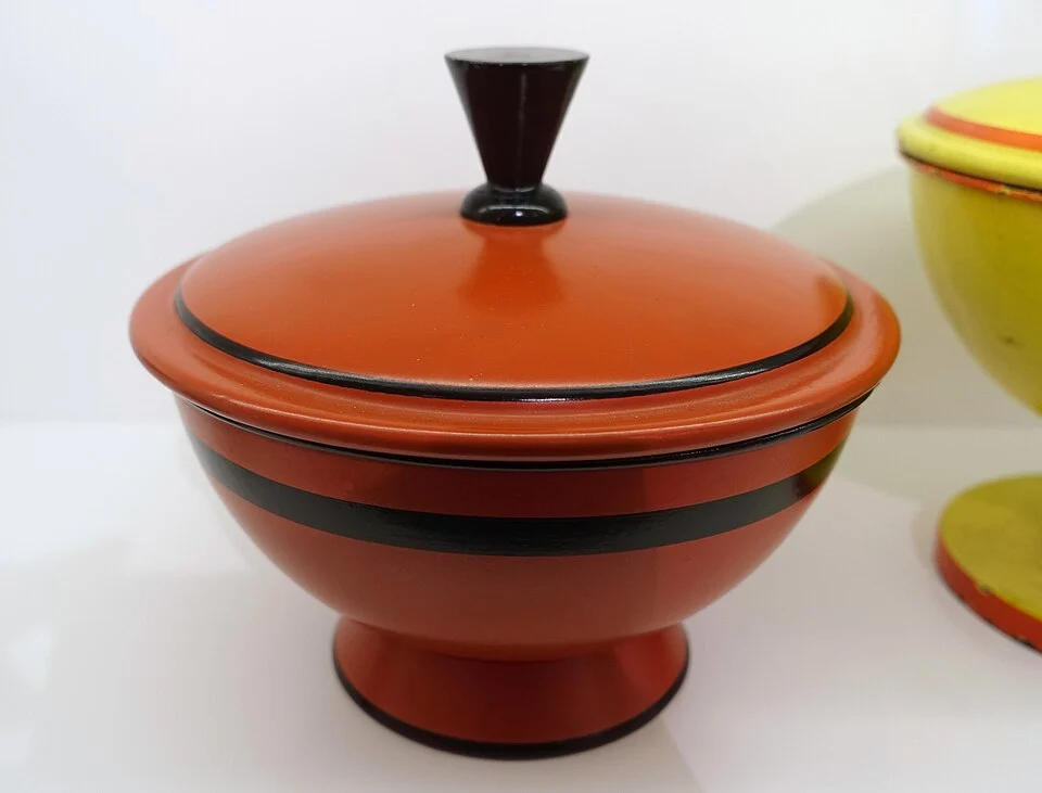
Marianne Brandt, sheet-iron jars, 1930, a related work, not the 1924 teapot
Daderot · Image source ↗ · CC0Observe the solid surfaces, simple outlines and geometric arrangement in this related metal design by Brandt; these are jars, not the teapot.
Visual DNA · 01
Circle, square and triangle are the start of every composition, often alone, in dialogue.
Compare the enlarged example with the palette below. Notice how this element affects recognition, rhythm and atmosphere.
#D62828#1D4E9E#F2C200#111111#F1EBDDIdentify the main shape, then see how colour, type and white space work together. Return to the page’s laboratory to change these parameters yourself.
Visual DNA · 02
Red, yellow, blue plus black and white. Kandinsky paired yellow with triangle, red with square, blue with circle.
Compare the enlarged example with the palette below. Notice how this element affects recognition, rhythm and atmosphere.
#D62828#1D4E9E#F2C200#111111#F1EBDDIdentify the main shape, then see how colour, type and white space work together. Return to the page’s laboratory to change these parameters yourself.
Visual DNA · 03
Geometric sans-serif, often lowercase only, stripping away everything unnecessary.
Compare the enlarged example with the palette below. Notice how this element affects recognition, rhythm and atmosphere.
#D62828#1D4E9E#F2C200#111111#F1EBDDIdentify the main shape, then see how colour, type and white space work together. Return to the page’s laboratory to change these parameters yourself.
Visual DNA · 04
Heavy black rules divide the page; text can run vertically or rotate, creating clear rhythm.
Compare the enlarged example with the palette below. Notice how this element affects recognition, rhythm and atmosphere.
#D62828#1D4E9E#F2C200#111111#F1EBDDIdentify the main shape, then see how colour, type and white space work together. Return to the page’s laboratory to change these parameters yourself.
Visual DNA · 05
Moholy-Nagy’s “typophoto” treats photographs and type as equal visual material.
Compare the enlarged example with the palette below. Notice how this element affects recognition, rhythm and atmosphere.
#D62828#1D4E9E#F2C200#111111#F1EBDDIdentify the main shape, then see how colour, type and white space work together. Return to the page’s laboratory to change these parameters yourself.
Medium explained · 01
Bauhaus posters used geometry, heavy rules and sans-serif type to turn an exhibition into a design manifesto.
Joost Schmidt, Bauhaus exhibition poster, 1923
Joost Schmidt · Image source ↗ · Public domainUse the caption to identify the actual person or work, then compare it with the creative methods and visual rules described above.
#D62828#1D4E9E#F2C200#111111#F1EBDDIdentify the main shape, then see how colour, type and white space work together. Return to the page’s laboratory to change these parameters yourself.
Medium explained · 02
Bayer’s Universal alphabet had only lowercase letters, each built from circles and straight lines: a typeface for the machine age.
Read the organisation of information, then the medium’s proportions and viewing distance: the same style makes different choices on a poster, cover or interface.
#D62828#1D4E9E#F2C200#111111#F1EBDDIdentify the main shape, then see how colour, type and white space work together. Return to the page’s laboratory to change these parameters yourself.